Case study
Teasperience
A tea company built from the ground up. The name it grew into, the logo, 200+ labels, packaging, print, signage and the website.
The brief
Everything, from the logo out.
Teasperience is a tea company I helped build from the ground up. I designed the whole brand: the teacup logo and wordmark, the color and type system, a label for every one of its 200+ blends, the packaging, the print and event signage, the merch, and the website. One system, from the first sketch to the shelf.
The identity
One mark, one system.
Built from scratch and documented, so the brand stays consistent everywhere.
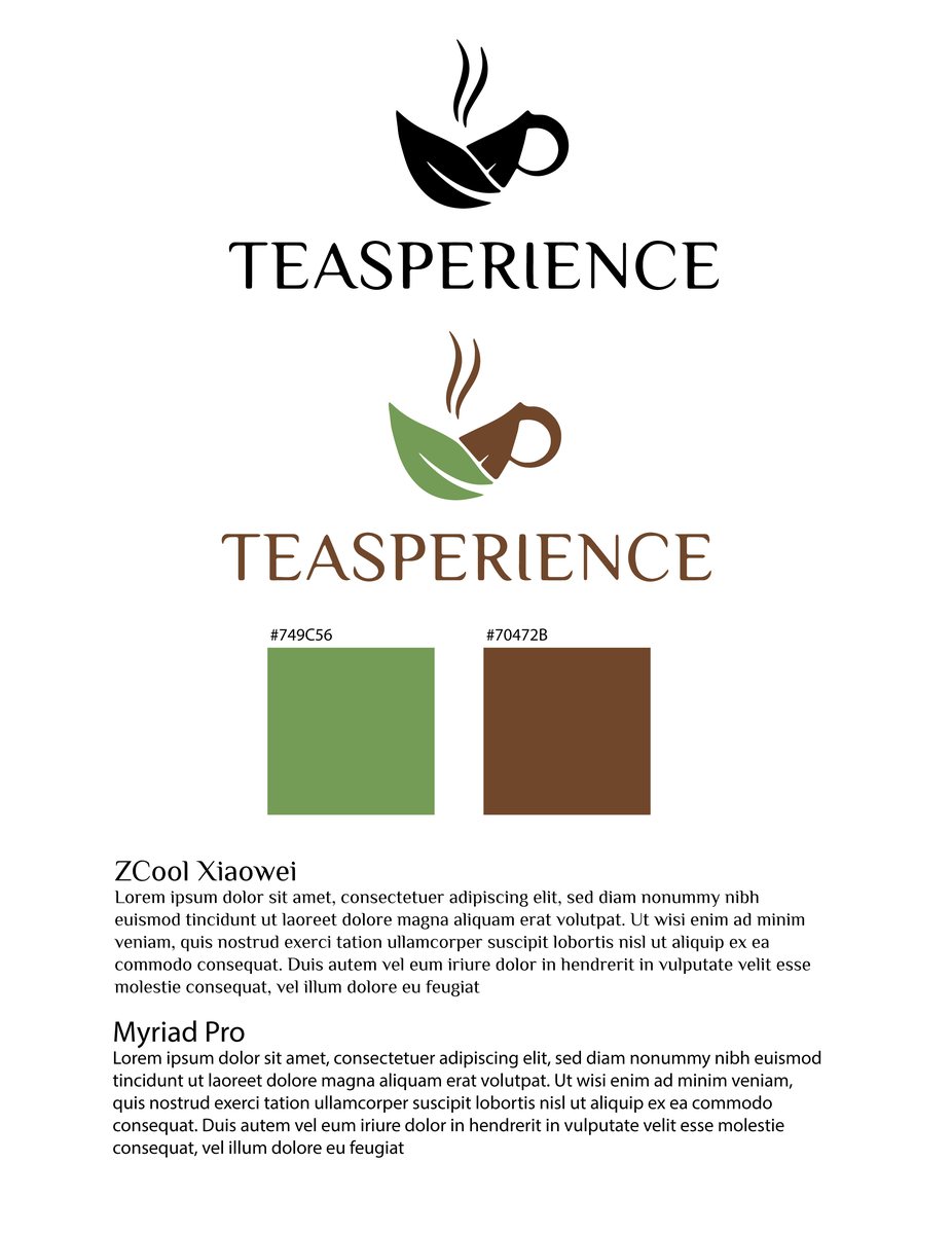
Logo & system
One teacup, head to toe.
The teacup logo, the wordmark, the green and brown palette and the type pairing, all created and documented so every surface reads as the same brand.
The packaging
A label for every blend.
Over a hundred blends, each with its own color and story, on one shared label system.
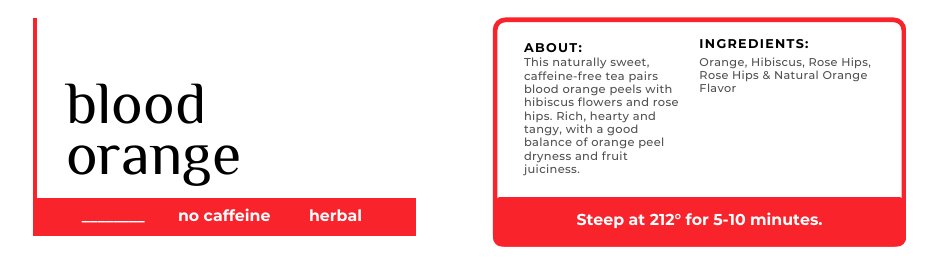
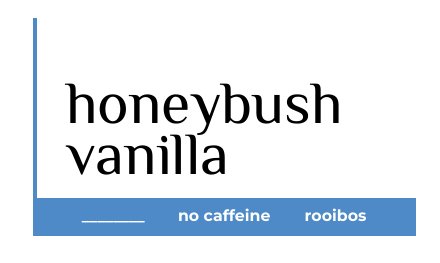
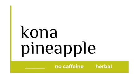
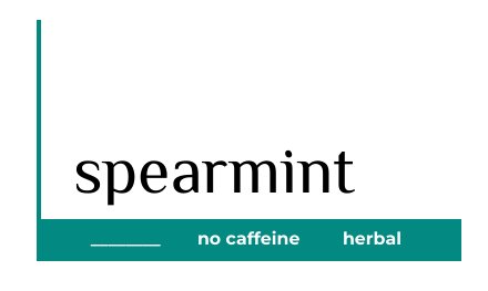
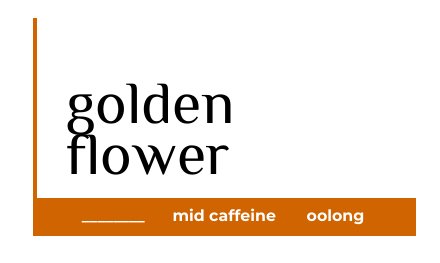
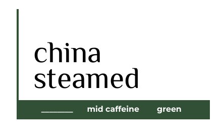
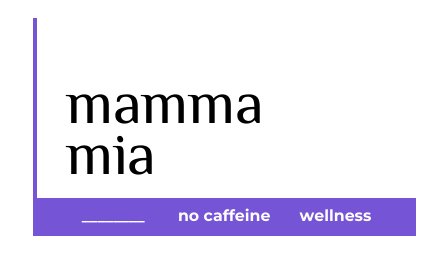
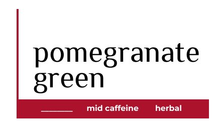
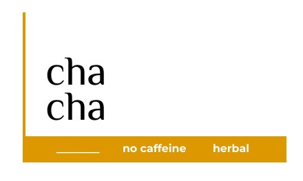
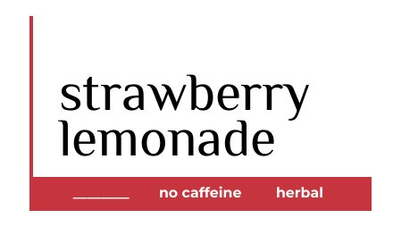
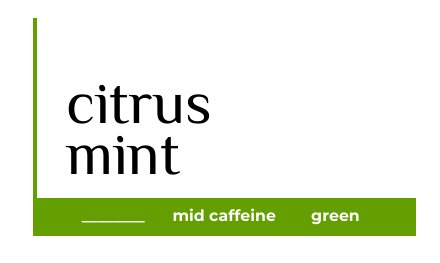
Twelve of more than two hundred blends, all on the same label system.
In the wild
The product, in hand.
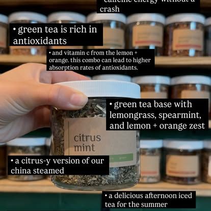
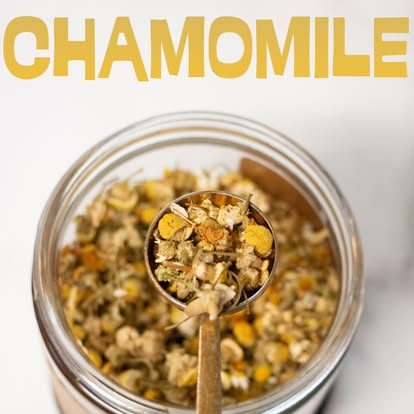
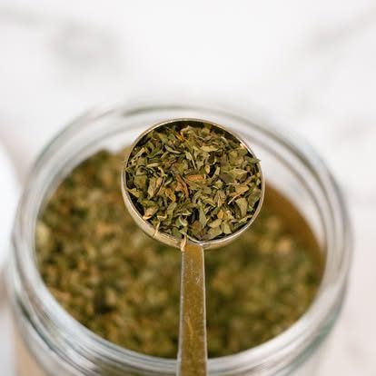
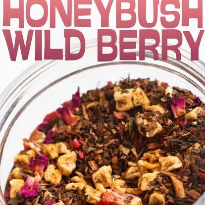
The labels on real jars, the tea inside, and a bit of personality.


The full kit
One brand, every surface.
Beyond the logo and labels: letterhead and notepads, a trifold brochure, a pull-up banner, business cards, a wholesale flyer, table linens, QR signage and the web presence. If it carried the Teasperience name, it came through here.
Have a brand to build from scratch?
Let's design all of it.
Tell me what you're working on and I'll come back with ideas.
Start a project